
Tuesday, March 31, 2015
Monday, March 30, 2015
Failed series 1 -- slashed and frayed
Recently somebody wrote to the Quiltart list asking us to look at her blog and give her some comments about her work. She wrote: "I have no friends (yet) in this community and no process for feedback locally. I also cannot afford to travel to shows and events. So it’s just me and my sewing room. I am desperately trying to find my 'voice' in fiber art. I would really appreciate those w/experience to help me with ANYTHING."
This struck a chord with me; twelve or thirteen years ago that was pretty much me. So I looked at the work on her blog and noticed that like me, twelve years ago, she had made a bunch of pleasant quilts that were not related to one another in any way. I wrote her back and suggested that she think of working in a series, building on work she had already done and progressing deliberately to repeat things that went well and avoid things that didn't. I said that I had written a lot about this subject in my blog and maybe she would find those posts helpful.
So of course I had to go back and review exactly what I had said in the past, hoping that they might actually be helpful. In one post I discussed when you should abandon a series, and promised that some day I would show you some series that I abandoned and tell you why. Readers, that day has come. Return with me to some of my great failures.
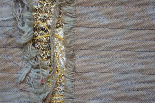
Several years ago I had a solo show in which I made a quilt for every letter of the alphabet. The Z quilt was particularly pleasing to me, because it was a big step forward in my courage to try non-traditional, non-nice technique. Recalling my childhood sword-wielding hero Zorro, who was wont to slash his initial into miscreants' shirts, I slashed a Z into a piece of canvas before dyeing it. By the time the fabric emerged from the washing machine, the edges of the slash had frayed beautifully. I put blood-colored fabric beneath the slash and let it peek out a bit from under the quilting stitches.

Remembering Zorro
I liked the effect so much that I wanted to try it again. The first time was a tiny reprise of the Z, using some canvas left over from my first experiments in fray/dyeing. The next was a small quilt with blue lamé-type fabrics peeking out from the slash, plus a few beads for extra glitz. The third time was a larger quilt with gold peeking out.
 Revelations 2: Heart of Gold
 Revelations 2 (detail)
I liked all the quilts up close. The frayed edges were nice, the quilting stitches had a good rhythm. The contrast between the rough, drab canvas top layer and the shiny, glam inside worked. But step back a ways and the quilts died. The composition wasn't strong enough to carry the day. I didn't realize at the time, but the simpler the composition, the more important it is to get it right, and these quilts just didn't hack it.
I had already slashed and dyed another piece of fabric for a fourth quilt in the series, but I decided to quit while I was behind. There wasn't enough promise in the three pieces I had made to keep me going. In retrospect I wonder if I made the right decision; there was something of value there and perhaps I could have made it work had I kept with it.
In retrospect, I also realize that the series sputtered to a close because it didn't have enough meaning to me. Yes, the "can't tell a book by its cover" theme is obvious. But that theme doesn't particularly resonate with me; I haven't spent a lot of time contemplating hidden meanings, or trying to figure out people whose inner and outer personalities are vastly different. It was a message that I didn't want to devote a year of my life to sending.
Bottom line: it might have worked visually, but not intellectually or emotionally. Abandon ship.
More failures later.
This struck a chord with me; twelve or thirteen years ago that was pretty much me. So I looked at the work on her blog and noticed that like me, twelve years ago, she had made a bunch of pleasant quilts that were not related to one another in any way. I wrote her back and suggested that she think of working in a series, building on work she had already done and progressing deliberately to repeat things that went well and avoid things that didn't. I said that I had written a lot about this subject in my blog and maybe she would find those posts helpful.
So of course I had to go back and review exactly what I had said in the past, hoping that they might actually be helpful. In one post I discussed when you should abandon a series, and promised that some day I would show you some series that I abandoned and tell you why. Readers, that day has come. Return with me to some of my great failures.
Several years ago I had a solo show in which I made a quilt for every letter of the alphabet. The Z quilt was particularly pleasing to me, because it was a big step forward in my courage to try non-traditional, non-nice technique. Recalling my childhood sword-wielding hero Zorro, who was wont to slash his initial into miscreants' shirts, I slashed a Z into a piece of canvas before dyeing it. By the time the fabric emerged from the washing machine, the edges of the slash had frayed beautifully. I put blood-colored fabric beneath the slash and let it peek out a bit from under the quilting stitches.

Remembering Zorro
I liked the effect so much that I wanted to try it again. The first time was a tiny reprise of the Z, using some canvas left over from my first experiments in fray/dyeing. The next was a small quilt with blue lamé-type fabrics peeking out from the slash, plus a few beads for extra glitz. The third time was a larger quilt with gold peeking out.

I liked all the quilts up close. The frayed edges were nice, the quilting stitches had a good rhythm. The contrast between the rough, drab canvas top layer and the shiny, glam inside worked. But step back a ways and the quilts died. The composition wasn't strong enough to carry the day. I didn't realize at the time, but the simpler the composition, the more important it is to get it right, and these quilts just didn't hack it.
I had already slashed and dyed another piece of fabric for a fourth quilt in the series, but I decided to quit while I was behind. There wasn't enough promise in the three pieces I had made to keep me going. In retrospect I wonder if I made the right decision; there was something of value there and perhaps I could have made it work had I kept with it.
In retrospect, I also realize that the series sputtered to a close because it didn't have enough meaning to me. Yes, the "can't tell a book by its cover" theme is obvious. But that theme doesn't particularly resonate with me; I haven't spent a lot of time contemplating hidden meanings, or trying to figure out people whose inner and outer personalities are vastly different. It was a message that I didn't want to devote a year of my life to sending.
Bottom line: it might have worked visually, but not intellectually or emotionally. Abandon ship.
More failures later.
Sunday, March 29, 2015


Thursday, March 26, 2015
Signs of the week
Thanks to my guest photographer, Matthew Loomis, for this shot of the Capitol in Madison WI.

Tuesday, March 24, 2015
It worked!!
Last week I complained about an entry form that wanted to know my age, as if that is important to the kind of art you make. I'm pleased to report that entering "0" did not get me thrown out for bad attitude. I was the featured artist on yesterday's "Artebella," the daily email from the Louisville Visual Art Association. (click here to see the entire post)


I sent in photos of my recent hand stitching project, words of advice. Not sure I have shown them to you before, so here are all three that I have completed. I used a set of small linen napkins that I acquired at our monthly grab bag, and mounted them on larger squares of linen.
I was disappointed that they didn't use the artist statement that I so thoughtfully wrote for this series, but seized upon "making her own clothes" and "quilting," references they found by apparently checking out my blog and website. I try to escape the Q word but can't run fast enough. But they did spell my name right!!
Here's what I have to say about the advice series:
After a career in journalism and corporate communication, I resolved to have a new life in visual art -- but I couldn't escape the text. And after decades of making fiber art with a sewing machine, I have happily resumed the simple hand stitching that I learned at my grandmothers' knees.
These samplers are a combination of old and new, as are so many of the good things in life.
Some of the advice is ancient, some is as new as the century. The found linens, lovingly used for decades on someone else's table, carry an aura of family tradition, now repurposed. Some of the advice is handed down through the generations; some is handed up from young to old. Choose the advice that you like best....
I still need to make the last piece in the series, "Two Words of Advice," but I have used all the napkins in that set and need to find two little napkins that will be the right size and character to work in the series. Just remember, "Carpe Diem."
Monday, March 23, 2015
Laurie Wohl -- Unweaving
I've seen a bunch of art and attended a bunch of art activities over the last several months that never managed to get written up for the blog. So in anticipation of a trip, during which I probably won't be able to post new things, I'm trying to catch up with some of the pending subjects. My apologies that some of the shows have already closed and the activities are long past.
I'll start off with a show by Laurie Wohl, a New York fiber artist who has concentrated on liturgical and religious-themed work. Her show at the Patio Gallery in Louisville was a series based on Christian, Jewish and Muslim poetry and spiritual texts. She wrote: "For this project, I emphasize particularly the common themes and striking parallels between Arabic and Hebrew texts, similarly rich in a poetry of spiritual love, an extensive poetry of exile, a poetry of nostalgia for Andalusia, and poetry speaking of enemies and reconciliation."
It's a daring subject in this era of widespread fear of radical Islam, to seek similarities between that religion and Christianity and Judaism. In fact, viewers might have shared the tiniest start to read Wohl's categorization as "the Abrahamic religions" -- we Judeo-Christians don't usually think of Islam as our sibling.
Wohl's works in this series make extensive use of calligraphy, mostly Hebrew and Arabic scripts, and also repeat the imagery of a veil, through her signature "unweaving" technique. Working with a heavy canvas, she slices either the warp or weft threads around the edge of a shape, then unpicks the weave to leave the other strands loose. Because the weaving process puts a lot of crimp into the strands, when they're set free over a long distance they're significantly longer than the woven part of the canvas, so they droop and/or bulge.


I missed the gallery talk so I didn't learn how Wohl achieves the sharp raised edges on her letters and shapes.

I could tell that she painted the "unwoven" strands of her canvases and often strung beads on them. Sometimes she sliced the free strands at the top of the shape so they would hang down below the unwoven area.


Usually she removes the horizontal threads and leaves the vertical, but not always.

I'm always intrigued by art that uses text or letterforms, and though I read neither Arabic nor Hebrew, I could tell that Wohl's calligraphy is exquisite. The works have a solemn presence as well as a bright and lively sparkle. The show was well worth a visit.
----
I've cross-posted this to Ragged Cloth Cafe, a blog about art and textile art. Drop by and visit us there some time!
Sunday, March 22, 2015


Friday, March 20, 2015

Wednesday, March 18, 2015
On retreat again
Last week was the second annual art retreat for ten of us who cherish a couple of days away from home (but only a half hour down the road), a whole empty table to yourself, and a lot of wine and junk food.


Somebody else was working on a template for a fantastically complex pieced quilt.


Monday, March 16, 2015
Working on entries again
I did three entries on Friday, which pretty much killed the whole day. And the contrast of the different processes made me realize again how show entries can be structured to make your life easy or miserable. Let me compare and contrast.
Show #1's calendar:
March 13 -- final postmark deadline
Mid-late April -- jurying
Early May -- email notification sent to artists
May 22 -- delivery of artwork
Show #2's calendar:
April 11 -- deadline for receipt of entries
April 20 -- notification
April 28 -- delivery of artwork
Both shows have a single juror, so there's no complication of trying to schedule conference calls or sit-downs with more than one person.
My question: Hey, Show #1, why does it take a month or more to open the envelopes, load up the images onto a single CD and get it to the juror? Then why does it take two or three weeks for the juror to make a decision?
Show #2, by contrast, contracted with the juror several months ago and asked her to block out one day on her calendar when she would commit to the jurying. With a couple of days of cushion on either side, this show will get the images to her, she'll get the decision back, and the notifications can go out the next day.
When you enter Show #1, you have to put three pieces of art in limbo for almost two months; for Show #2 it's only two and a half weeks. I've entered shows in the past where the limbo was more like three months, and I always wonder why that's necessary. I understand why show organizers don't want to put themselves into too tight a box -- somebody could get sick, or her computer could go on the fritz, or a snowstorm might delay mail delivery. But months of lead time seems like way too loose a box.
And that leads me to discuss Show #3, for which I took quilts to FedEx earlier in the week. This show combined too-tight and too-loose in the same schedule. After jurying, Show #3 realized that most of the accepted works were on the small side, while the gallery was definitely on the large side; there was way too much empty space left over. So the juror invited several artists to send works that would fit the same theme as the juried show, and the two groups of artists would be displayed side by side.
I am one of those who will be in the invitational part of the show, and the total elapsed time for issuance of invitation, reply, review of images and confirmation of which quilt they wanted was less than six hours! That's what I call a speedy review process, and it made me feel exhilarated to be a part of the show.
But then they sent the shipping info, and it transpired that they wanted the quilts to be delivered more than two months in advance of the show. Perhaps they have an ulterior motive (they're going to do a catalog, but it seems a pricey luxury to reshoot photos...) but they didn't share it with the artists. It made me wonder what's going on, and a bit of my exhilaration seeped away.
Finally let me complain a bit about Show #4, the entry for which I also wrestled with on Friday. This is not a brick-and-mortar show but an online series that features a new artist every day. I was greatly impressed by their online entry form. It was easy to use, the upload of images worked smoothly, the questions they asked (they write a short essay about each artist, using the info provided on the entry form) were intelligent and perceptive.
I was a happy camper until I got to the demographic info and they wanted to know my age. I figured it was none of their business, and wrote N/A. The system kicked it back because I hadn't entered a "valid number." So I entered "0" and it was accepted. (At least until a human being takes a look at it, at which point I may get rejected just for noncompliance.)
I don't consider myself a vain person, I'm not ashamed of having reached the grand old age I have, nor do I try to pretend to be 39 any more, but I have a hard time understanding why my age -- or any other artist's age -- is relevant. This isn't a career retrospective at MoMA or a catalog raisonne, it's a little email with three images of my work and a half paragraph of bio. I'm obviously not young enough to be labeled as an emerging artist but I sure as hell am not willing to be labeled as a Grandma Moses old lady. That's a cage that too many older artists -- especially women -- can get shoved into. The gee-whiz-she's-so-old-it's-surprising-she-can-still-hold-a-needle-and-not-drool-all-over-her-work condescension so easily diverts the focus from one's art to one's age. And I really want to avoid that stereotype, especially since my medium is so grandmotherly to begin with.
With any luck, I won't have to do any more show entries for a couple of months, and with any luck I won't have to do three of them in one day. It's enough to drive you to drink.

Sunday, March 15, 2015
Photo suite 168 -- with Arnold on vacation
One of the lessons in my photoshop class was to select parts of images and do interesting things with them. I decided to put Arnold Schwarzenegger into some of my vacation photos. First I had to give him a Hawaiian print bikini.

in Antarctica

at the Acropolis

in Tuscany with my glamorous daughter-in-law
 in Tasmania
Thursday, March 12, 2015

Tuesday, March 10, 2015
Gee's Bend in the news again
The New York Times last month reviewed an exhibit of Gee's Bend quilts at the Lehman College Art Gallery in New York City.
 |
| New York Times photo |
Yes, the reviewer loves them, and points out, "What makes this tradition so compelling is that unlike most quilts in the European-American tradition, which favored uniformity, harmony and precision, Gee's Bend quilts include wild, improvisatory elements: broken patterns, high color contrasts, dissonance, asymmetry and syncopation." (A great checklist for quiltmakers looking to bust loose.)
But she also observes, "The dire need for warmth and comfort that drove these women to create innovative designs... is happily a thing of the past. As much as this exhibition is a record of the present, it also suggests that the soulful stitching tradition from the bottomlands may be near the end of its run."
Physics brought us the famous Heisenberg uncertainty principle, which maintains that the very act of observing something changes it. Moving out of the realm of physics, the same effect occurs when a previously sheltered individual or tradition gets discovered and is dragged into the modern celebrity machine.
The Times reviewer points out, for instance, that since the Gee's Bend quilts are showing up in museums, the makers have started giving them titles. And she suggests that the earlier quilts (these were all made since 1990) "made after picking cotton, between chores and child-rearing, have a slightly more breathless quality."
Once you've had stamps issued picturing your quilts, once you've toured the country attending opening receptions at museums, once they're making rugs in China from your designs, it's never the same.
I've observed the same thing with a lot of Kentucky folk artists. Once upon a time they sat on the porch up the holler and painted or whittled wonderful things that they sold for ten bucks. Then they were discovered, and their work started selling in four or even five figures. And then it became ever-so-slightly worldly, cynical and commercial. The great old stuff is rightly enshrined in museums, but the not-quite-so-great stuff is in the gift shop.

I don't begrudge the ladies of Gee's Bend a single penny of the profits from their celebrity, in fact I wish they were getting more of the pie instead of having a lot siphoned off by handlers and licensers. But I not only agree with the Times reviewer that the show is near the end of its run, I think that's probably a good thing. I saw the original Gee's Bend show at the Museum of Fine Arts in Houston, which was fabulous, and I've seen second-generation exhibits of newer work made to cash in on the popularity of the original, which were noticeably second-rate.
Trying to replicate the gloriously intuitive and unique creations of those outsider artists is a difficult task for their daughters and granddaughters (not to mention the artists themselves), especially now that they've seen Paree.
Monday, March 9, 2015
Class is over
I've been taking two classes in Photoshop Essentials from Kris Sazaki and Deb Cashatt, aka the Pixeladies; the second one ended three hours ago (not that I was awake to be there at the bitter end). This was my first experience in online learning and I absolutely loved it.
There were 12 lessons in each course, generally staged up as four lessons per week. You could take your time getting around to the lessons if you had to -- for instance, I missed the entire first week because I was out of town -- but you couldn't start the next set of four until Monday morning of the appointed week. There was a final week with no new lessons, just time for people to complete their work and ask questions.

The Pixeladies have an excellent interface that you log on to at your convenience. For each lesson, you start by watching a video of somewhere between 10 and 40 minutes; it shows the Photoshop screen and you see Deb's cursor move around as she explains what she's doing. You can download a handout, but I almost never consulted mine; I just took notes during the videos.

Then you post your homework for each lesson, and if you have questions, you can post them too. The genius of the teaching plan is that either Deb or Kris, or usually both, seems to be working at all hours of the day and night; sometimes only a half hour would pass before one of them had looked at your post and responded. If you couldn't get the program to work as you wanted, you could post a screenshot of what you were looking at so they could find the problem, and they might post a screenshot in return to show you where to click.

Best of all, we'll have six months of access to the website, to review the videos and re-read the posts and questions from everybody in the class (amazing how much you can learn by eavesdropping on other people's frustrations and successes).


The course is geared to quilters, and some of the lessons were specifically aimed at quilting-type issues, such as how to turn a photo into a simplified value-scale posterization that you could use to make templates for piecing or applique, or the pros and cons of different companies that will print your designs onto fabric. But especially as we got into the more complicated lessons at the end of the course, it was just general knowledge of how the program works.

Friday was Deb's birthday so I used my new skills to make her a card.
I can't recommend this class highly enough. I plan to sign up for the intermediate-level class that they are hoping to get ready for sometime this summer. Meanwhile, they're teaching the two beginning classes again in a few months. Details not available yet, but I'll give you a heads-up as soon as they announce the schedules. I can't imagine that you would be disappointed in any of their classes.
Sunday, March 8, 2015
Photo suite 167 -- hanging pictures
If you saw the last two weeks' photo suites you know that we have had several rooms repainted. Now it's time to get the pictures back on the walls -- which is more work than it should be. While I hung pictures the other day, our favorite four-year-old documented the process, which explains the low camera angle. (I think he's got promise as a photojournalist!)


Subscribe to:
Posts (Atom)